
Choosing the Right Viewport Unit in CSS: vh, svh, lvh and dvh Explained
Viewport units used to be simple. You had vh and vw, and that was enough - until mobile browsers made things complicated.
If you’ve ever struggled with layouts jumping when address bars, toolbars, or other UI elements appear or disappear, you've already run into the limitations of classic viewport units. Fortunately, modern CSS gives us better tools: svh, lvh, and dvh.
The Problem with vh
Traditionally, height: 100vh means "100% of the viewport height". But on mobile browsers, the visible viewport height can change as browser UI (like address bars) appears or disappears during scrolling. As a result, 100vh can be too tall or too short, causing content to overflow, unwanted scrolling, or layout jumps.
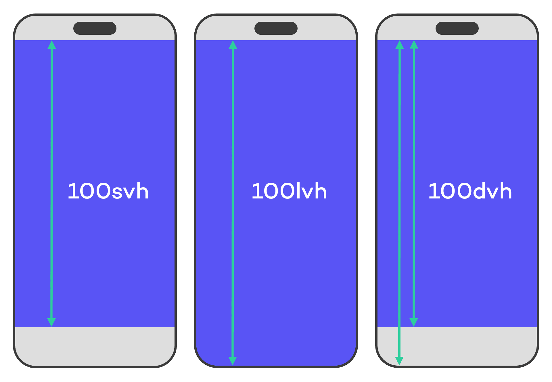
Modern CSS introduced new viewport units to address this:
svh(small viewport height)lvh(large viewport height)dvh(dynamic viewport height)
When to Use Each Unit
Choosing the right viewport unit is pretty straightforward and depends on the behavior you want for your layout:
- Use
svhwhen you want to size your layout based on the smallest viewport height, typically when browser UI is fully visible. - Use
lvhwhen you want to size your layout based on the largest viewport height, typically when browser UI is collapsed. - Use
dvhwhen you want your layout to adapt dynamically to viewport changes, such as when browser UI appears or disappears during scrolling. Keep in mind that this can cause layout shifts, since the value updates dynamically as the viewport changes.
Browser Support
svh, lvh, and dvh are supported in nearly all modern browsers. But if you want to be extra cautious, you can provide fallbacks for older browsers:
.element {
  height: 100vh; /* Legacy viewport behavior */
  height: 100dvh; /* Modern dynamic viewport behavior */
}
Final Thoughts
In most modern layouts, dvh is a practical default, but svh and lvh still have their place when you want stricter control over layout stability.
Understanding the differences helps you avoid one of the most common mobile layout issues: unexpected height changes caused by browser UI behavior.